There are seven new chart types added to the Spreadsheet component in the Windows application. These charts were first introduced to Microsoft Excel 2016, and are now available in our spreadsheet component as an alternative to using Excel.
The OneStream Windows application spreadsheet feature does not require that Excel be loaded on your computer. It can be used for querying and reporting, analysis, data entry, and formatted reports. The Spreadsheet feature allows you to remain in the Windows application using Excel-like functionality.
This is an enhancement to the existing spreadsheet component in the Windows application. It is available to administrators or general users with security rights to access it.
Chart Types
Microsoft Excel 2016 introduced several chart types that help you visualize financial, statistical, and hierarchical data. They include:
-
Box and Whisker
-
Waterfall
-
Histogram
-
Pareto
-
Funnel
-
Sunburst
-
Treemap
You can add charts to a OneStream spreadsheet worksheet in the same manner as any other chart type. Chart styles allow you to quickly change chart appearance. Styles change the background fill, specify the color of the data series, and apply different shape effects and outlines to the chart.
To apply Excel 2016 chart types to a predefined chart style, right-click on the chart and select one of the available styles.
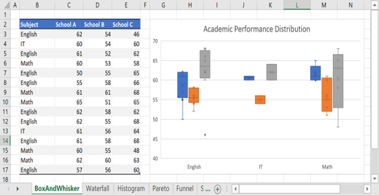
Box and Whisker
A box and whisker chart shows distribution of data in quartiles, highlighting the mean and outliers. Boxes may have lines extending vertically called “whiskers.” These lines indicate variability outside the upper and lower quartiles, and any point outside those lines or whiskers is considered an outlier.
Box and whisker charts are commonly used in statistical analysis. For example, you could use a box and whisker chart to compare medical trial results or teachers' test scores.
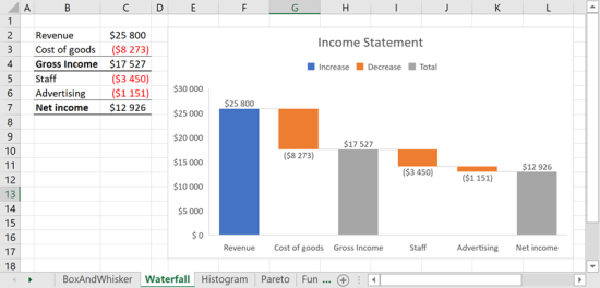
Waterfall
A waterfall chart shows a running total as values are added or subtracted. It is useful for understanding how an initial value (for example, net income) is affected by a series of positive and negative values. The columns are color coded so you can quickly tell positive from negative numbers. The initial and the final value columns often start on the horizontal axis, while the intermediate values are floating columns.
If your data includes values that are considered Subtotals or Totals, such as Net Income, you can set those values so they start on the horizontal axis at zero and don't float. To do this:
-
Right-click on the chart and select Set as Total.
-
In the dialog box, select the checkbox for value(s) in the dataset to be set as Total.
-
To make the column float again, clear the Set as total checkbox.
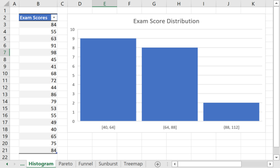
Histogram
Data plotted in a histogram chart shows the frequencies within a distribution. Each column of the chart is called a frequency bin.
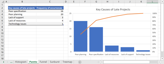
Pareto
A pareto chart is a sorted histogram that contains columns sorted in descending order along with a line representing the cumulative total percentage.
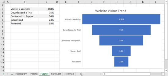
Funnel
Funnel charts show values across multiple stages in a process. Typically, the values decrease gradually, causing the bars to resemble a funnel. For example, you could use a funnel chart to show the number of sales prospects at each stage in a sales pipeline.
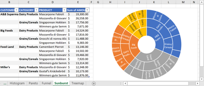
Sunburst
The sunburst chart displays hierarchical data and can be plotted when empty (blank) cells exist within the hierarchical structure. Each level of the hierarchy is represented by one ring or circle with the innermost circle as the top of the hierarchy. A sunburst chart without hierarchical data (one level of categories), looks similar to a doughnut chart. However, a sunburst chart with multiple levels of categories shows how the outer rings relate to the inner rings. The sunburst chart is most effective at showing how one ring is broken into its contributing pieces.
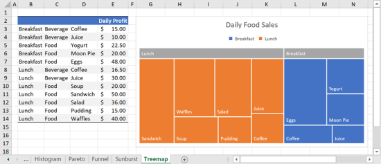
Treemap
The treemap chart provides a hierarchical view of your data and an easy way to compare different levels of categorization. The treemap chart displays categories by color and proximity and can show data which might be difficult to display with other chart types. The treemap chart is plotted when empty (blank) cells exist within the hierarchical structure. Treemap charts are good for comparing proportions within the hierarchy.
Conclusion
These chart types help you visualize financial, statistical, and hierarchical data inside the Windows application spreadsheet component. They are ideal for those who prefer working inside the Windows application rather than Microsoft Excel.


